NOT YOUR AVERAGE PENCIL.
Not just pencils—companions for every creative journey. From the first shaky line of a toddler learning to write their name, to bold strokes from a seasoned doodler, Pencil Buddies were made to grow with you.
The first marks a kid makes on paper aren’t just scribbles—they’re sparks. Sparks of creativity, confidence, and adventure. And with Pencil Buddies, those sparks turn into masterpieces.
We worked with MKTNG by Design on this project to produce a mascot design that would lead the way for a whole bunch of Pencil Buddies. The existing branding, while functional, didn’t fully capture Pencil Buddies commitment to the story telling vision or its playful, people-first approach. This rebrand needed to shift perceptions—positioning Pencil buddies as the go-to name for kids first pencils and stationary all while injecting personality, emotion, and a sense of fun into the experience.

NOT YOUR AVERAGE HERO.
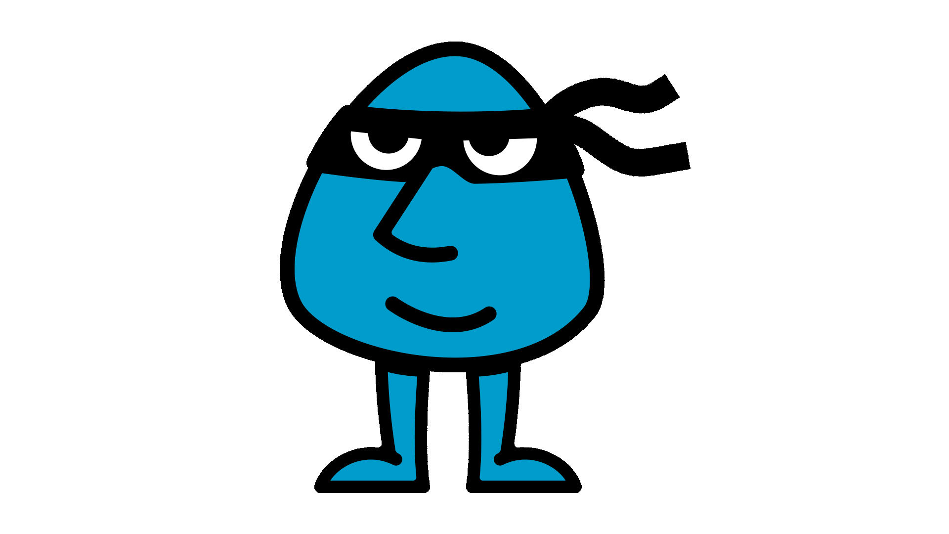
Cooper by day, Captain Coop by night. A special hero for a special product.
We knew from the start we needed to keep this simple. Drawing strong inspiration from the very unique aspects of the pencil buddies pencils. We created a mascot that will capture the customers heart at first glance. Easy to remember for kids and adults, easy to draw too(with a bit of practice).
Our everyday hero dawns his mask, a nod to all those hero parents out there, with a simple mission; capture the imagination.


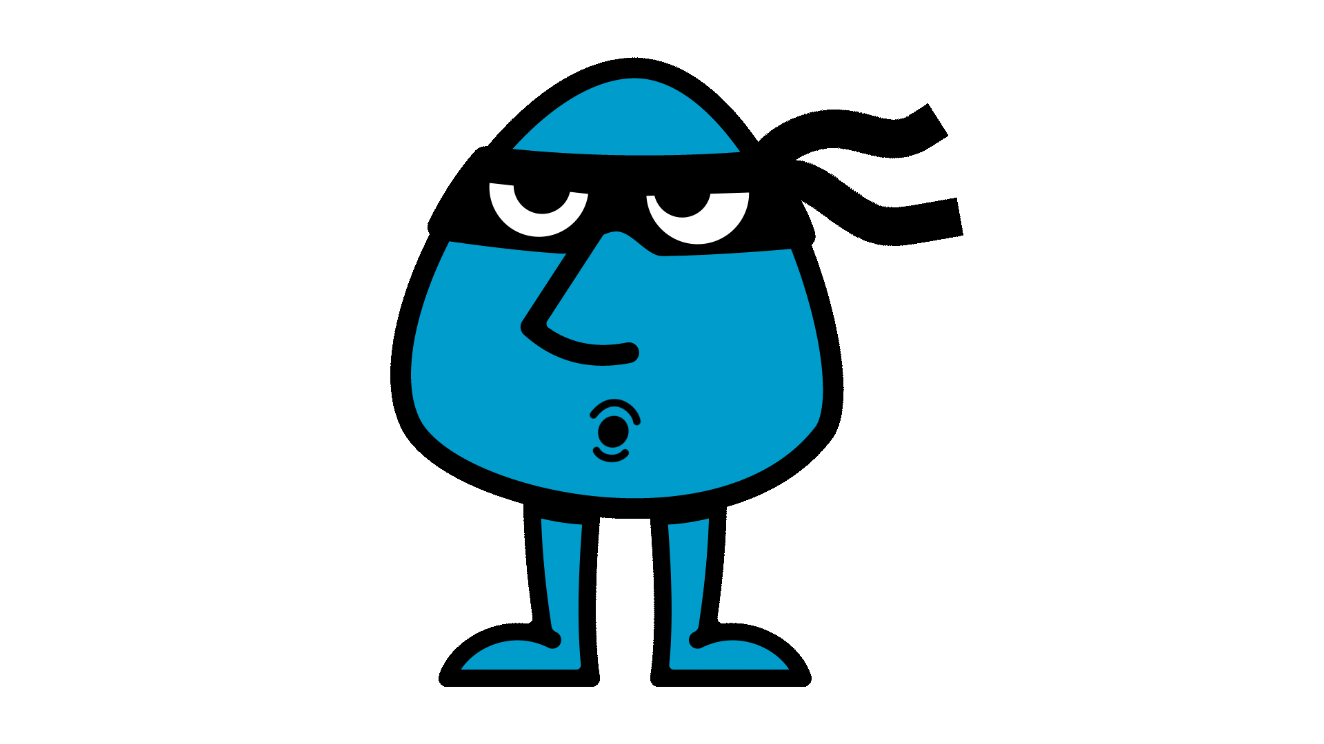

The Captain Coop palette is made up of a muted cool blue tone, known as buddy blue. This is aimed at creating a child friendly colour which will work for adults too. The blue nods to a calm, breezy and care free attitude. The muted tone will tie in well with the full suite of colours for the brand.
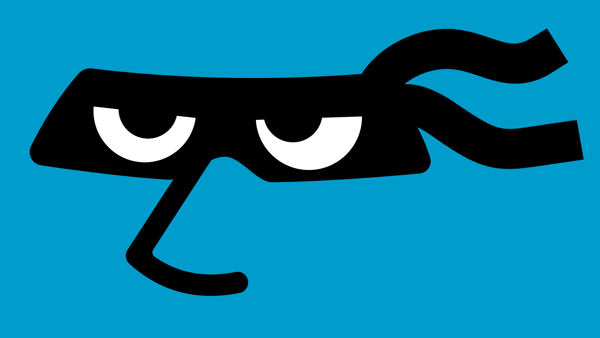
Buddy blue is paired with clean and simple black and white accents, these provide a slick contrast to the blue producing sharp and distinctive features on the logo. The black and white contrasting colours will work with all alternate brand colours of other characters.

The pattern provides a playful hand drawn contrast to the sharp and clean look to the logo. This can be used independently as a consistent fill for large areas or as accent to the logo. The idea of the pattern is to encourage users to be creative and add their own ideas to help tell the story of our characters.